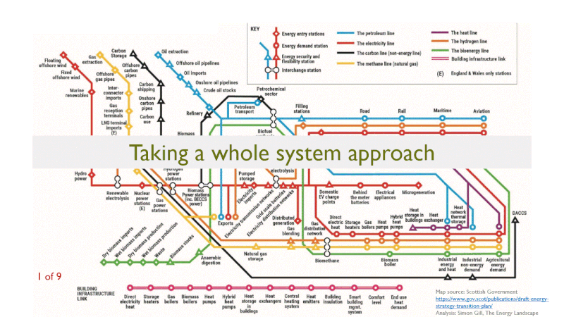
Visualising the whole energy system: I was delighted to see The Scottish Government publish two energy system maps as part of the recent draft Energy Strategy and Just Transition Plan. These aim to lay out an infrastructure view of the whole system. Whilst working at SG I designed these maps with teams covering all aspects of energy related policy. The analogy is a tube map with lines representing different energy vectors and stations representing each infrastructure element.
The gif shows an example analysis of one particular intervention we might make in the energy system: transition of some road transport demand, specifically, heavy vehicles to hydrogen. Why is this a whole system challenge:
1. Transport demand now needs a hydrogen system to serve it with low carbon energy, and overtime we expect this to grow into a mature, complex, national system with multiple sources and consumers for hydrogen.
2. But hydrogen is only an energy vector, not a source. Energy needs to enter the hydrogen system (in the tube map analogy ‘interchange stations’ represent places where energy moves from one vector to another).
3. Those linked energy vectors – electricity, natural gas and bioenergy – now also become important parts of the transport-energy supply chain.
4. If we are talking about using natural gas as the primary source of energy, or if we want to consider opportunities for negative emissions in conjunction with bioenergy, we need to pair those vectors with a Carbon Capture and Storage infrastructure.
5. Finally, meeting transport demand for hydrogen means not meeting that demand from petroleum and oil. That’s the point! But we still need to think about an orderly transition between the two. In a phrase: a hashtag#JustTransition.
When you think about it like that, moving some transport energy demand to hydrogen creates ripples that cover the whole of the energy system.
The maps aren’t perfect. They aren’t meant to be. The current version doesn’t have a station for energy supply for Direct Air Capture (DAC). This is important because capturing 1 MTonne of CO2 with DAC requires around 1.6 TWh of energy; that’s equivalent to about 5% of Scotland’s current electricity demand. Where does that energy come from? Which vectors does it use? What additional pressure does it create and on which infrastructure groups?
I hope those two examples highlight the value of the maps: they can help us see which bits of the energy system might be affected by an intervention, they can spark new thoughts and start interesting and important conversations about how to join up the bits of our future energy system. For me (being visually minded) they also provide a mental model for the energy system which helps me organise my thinking.
Fantastic job Mel MacRae and Katie Phair and everyone else getting this publication out. I look forward to many discussions over the coming months about Scotland’s Whole Energy system.
hashtag#NetZeroScotland hashtag#Energy
